Monday 27 January 2014

Who would be the audience for your media product?

This is Marina Martins, she is fully British. Marina is 17 years old, lives in Brighton and is studying fine art in university. She also has a part time job in HMV. She is always having cereals for breakfast as she doesn't have time for anything else in the morning. She has a high interest in make up, art and music. Marina is a guitar player and a song writer in a spare time. She buys her clothes online, from stores such as Drop Dead, Criminal Damage and Impericon. However, she also likes H&M and Topshop. Her fashion style is mixed as she likes hipster and grunge clothing mixed with scene clothing. Most of the time you'll fine her wearing a band t-shirt and skinny jeans. Her favorite films are Lord of The Rings, The Hobbit, Sherlock Holmes, Jack the Ripper and Saw. She usually watches them online on her laptop. Marina also likes tv series such as Skins, Misfits and The Walking Dead which she also watches online and occasionally on TV. Marina doesn't watch much TV but when she does it's usually Kerrang TV or BBC Three. Her favorite genre of music is rock, punk and metal, to which she usually listens on her iphone or on Youtube. She sometimes also likes to listen to radio, her favorite stations include: XFM, Kerrang Radio, Planet Rock.  Her favourite bands are Bring The Horizon, Green Day and Fall Out Boy. Her favourite magazines are Kerrang!, Rock Sound, Metal Hammer and Neo Magazine. Marina buys every issue and also collects them
Social sites that Marina is using are Facebook, Twitter, Tumblr and Instagram. She is using an app called 'what's app' to communicate with friends.
I think that my magazine would appeal to this person as she likes the genre of music that my magazine is about, also she already reads magazines simillar to mine. Also, she is a stereotypical 'scene/emo' girl that likes heavy music and is wearing skinny jeans and band t-shirts. 

Tuesday 21 January 2014

Teen movies posters

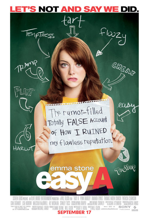
Easy A Movie Poster
'Easy A' is a teen comedy film about a young teenage girl that is lying about loosing her virginity to increase her social life. From the first look at the poster, we can see a use of chalk board as a background. This shows that a main subject of this film is a school life. By the look at the writing on the background we can see some words such as 'easy' and 'tramp' with arrows pointing at the girl in the middle. This shows that those are the words to describe the her, this shows that her lie didn't work the way she wanted it to work. We can see from the writing on the poster that she is not a 'good student' as she is being called 'easy'. It shows that teenagers want to fit in, so they are lying just to impress others. We can also see it in the slogan 'Let's not say we did'. The layout is very simple, we can see a medium shot of a teenage girl with the title of the film at the bottom of the poster.  

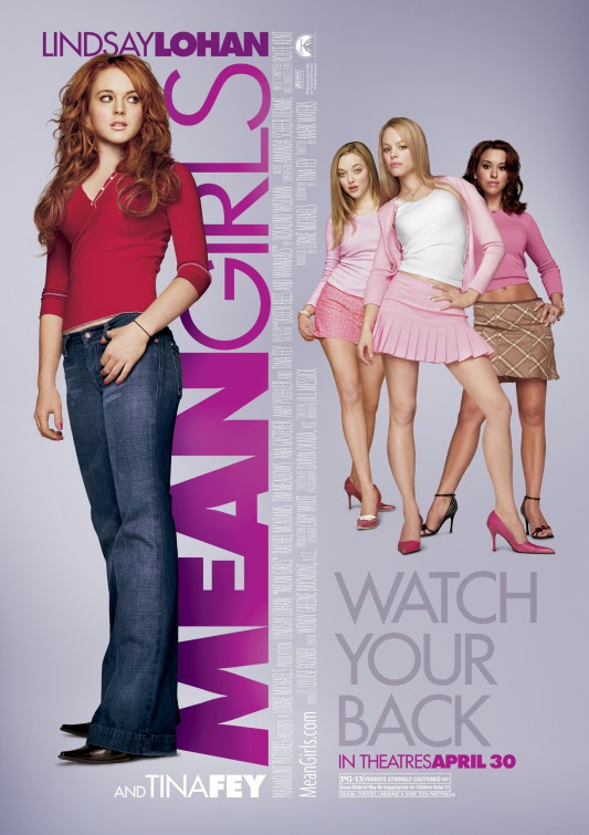
Mean Girls Movie Poster

 Mean Girls is another teen comedy film. It talks about a new girl from African and a group of girls which are pretending to like her. From looking at the poster we can see a group of girls all dressed in pink what shows that they are very girly. However, we can see that a girl on the right hand side of the poster is wearing a brown tartan skirt and brown hair. She clearly stands out as she is contradicting the stereotype of brunette girl, as she is acting blond.  We can also see a girl on the left hand side, she is wearing jeans and a plain t-shirt. This shows a binary and opposition. The colours that we can see on the poster are mainly purples and pinks. This shows that the target audience for this film is mainly all girls. 
The difference between this poster and the other one is mainly the colour scheme. I would say that the target audience for 'easy a' is more open as it is a film for all teenagers and 'mean girls' is more for girls. Also the layout is very different as text on 'mean girls poster' is all over the place, it's not as clean.


Juno is another teen comedy film talking about a teen pregnancy. The background of the poster is quite simple as its only orange/ white strips which are also present on the girl's top. The font that has been used is quite childish compared to other posters. We can see what the film is about from looking at the main character. The layout of the poster is also very simple as on one side we have a picture of the characters and on the other side we have the text. The colours that have been used on the poster shows that the film is not for a specific gender. From the look at the way that characters are shown, we can see a teenager girl being pregnant. She is not a stereotypical girl as she is wearing plain and simple clothes.  From the look at the guy we can see that he is 'goofy/ nerdy', we can tell that from the way that he looks.


Sunday 19 January 2014

Art Magazines Research

As my task for this week is to create a college magazine, in today's post I'm going to look at the examples of art college magazines. This will help me with my research and will give me an idea of how a professional magazine cover and content page should look like.
 This will give me an idea of the layout that my magazine should have. I'm going to look at the way that they present themselves and also at the use of pictures. I'll also use them as an inspiration for my final idea.

COVERS:

This is one of examples that I've found. This is a cover of a 'computer arts'. I decided to look at this magazine as it shows a good layer, we can clearly see a name of a magazine. The magazine is very detailed in the information. The use of colours is also very effective as it is eye catching and the writing is readable. The use of colours shows that target audience for this magazine would be teenagers/ young adults. Furthermore, we can tell that it is an art magazine as on the cover we can see a work of an artist that is a main focus of the magazine. The writing on the magazine is also readable as they have their own space around the picture. The font is bold and simple what makes is readable. It also makes the cover page look clean and professional. 


This is another cover done by the same magazine however, this time we can see a different layout. We can see much more information of the cover. Also this time we can see more than a one picture as we can see a main picture of the art work, we can also see a small picture on the left hand side which shows a master shot. The main art work is shown in close up. Furthermore, even that there is so much going on the text is still readable because of the use of  different colours 'bubbles'. This type of layer could work more for a college magazine as it is very informative and it is also very eye catching. However, the layout looks more like content page because of the amount of the information that it has.


By looking at this cover we can see a clear layout, we could call it more 'tradition'. This type of layout is used with most of the 'high class' magazines. We can see a main focus which is a portrait which is showed in close up. However, the over all look of the magazine is quite boring as it doesn't use a lot of colour. The main colour of the font is white what makes the magazine cover look boring and simple. On the other hand, this layer would be perfect for an art college magazine cover as it is informative and clearly shows that the main focus of it, is fine art. We can clearly see a difference between the look of graphic art magazine and fine art magazine. We can see a minimum use of colour as this magazine is targeted at a older audience.


CONTENT PAGES:


This is a content page from the 'computer arts' magazine. The layout is very simple, we can see pictures on one side and text on the other. We can also see an annotation at the bottom of the pictures, it says where to can find more information. The font style is repeated what creates a clean look.  


Wednesday 15 January 2014

Representations of Teenagers

Teenagers have always been stereotyped into different categories. It is quite similar to the characteristics that they have in 'teen dramas'. They would fall into categories of:  juvenile/delinquent, dumb, superficial and sarcastic, self-aware and bitter.

Today I'm going to talk about how teenagers are represented in media text. For my first example I'm going to use Kerrang! magazine.

Kerrang! Magazine is specifically targeted at teenagers which are interested into rock/metal music. Teenagers are most likely to read this magazine as they are usually talking about new/ young bands. They are not the types of bands that you would see is 'Classic Rock' magazine, as classic rock magazine is talking about bands from the 80-90's. 

 . The usual stereotypes of teenagers that read Kerrang! are 'Emo's or Scene kids'. Society sees them as rebels, they usually wear dark makeup, skinny jeans, side fringes and black hair. So, the usual alternative look is going on. We can think that it is the truth, as most of the artists and band members that Kerrang is writing about are looking that way. We can say that the look of the bands are influencing teenagers to look the same way. That is the reason for a lot of alternative clothing and merchandise adverts all around the magazine. They want to have the same clothes as the band members and also band t-shirts of their favorite band. 

I think that it is pretty realistic representation as i do have friends that are reading this magazine and they do look more alternative. What means coloured hair, tattoos and piercing (society calls them emos or scenes). Even, me as reader of Kerrang magazine. I do look more alternative on daily bases; band shirts, piercing and dark makeup. It is very stereotypical but it is the correct representation and it is realistic. However, some of the people look 'normal' they don't have that alternative style and are not rebellious. So it does depend on the person and how interested they are in content of the magazine. 
Teenagers are made to appear different from adults, as adult wouldn't read this kind of magazine as it is not the music from their generation. From this magazine, teens appear to be rebellious, wild. something and people would call 'hardcore'. Teenagers are more wild then an adults, as they are dyeing their hair crazy colours and want to have more and more tattoos. It makes them look irresponsible.


Sunday 5 January 2014

X-Men Origins (Swede)

In today's post we are going to look at the swede, that me and my group has been working on. Everyone has been taking a part in creating this swede and I hope that you will help us by watching it and sharing it with friends


The Hobbit: The Desolation of Samug (EXHIBITON RESEARCH)


Today we are again going to look at The Hobbit: The Desolation of Smaug. We are going to look at some facts about the exhibition.
 

How many 3D IMAX cinemas are there in the UK?
  1. Odeon Swiss Cottage and Imax
  2. Odeon Greenwich and Imax
  3. Odeon Wimbledon & Imax
  4. Odeon Kingston & Imax
  5. Odeon Uxbridge & Imax
  6. Odeon Norwich & Imax
  7. Odeon Southampton & Imax
  8. Odeon Trafford Centre & Imax
  9. Odeon Manchester & Imax
  10. Odeon Imax & Kingston
  11. Odeon gateshead & Imax
  12. Odeon Cardiff & Imax
  13. Odeon Braehead & Imax
  14. Odeon Liverpool & Imax
  15. Cineworld Enfield & Imax
  16. Cineworld Birmingham & Imax
  17. Cineworld Crawley & Imax
  18. Cineworld Sheffield & Imax
  19. Cinemaworld Imax Glasgow Science Centre
  20. Cineworld Ipswich & Imax
  21. Cineworld Nottingham & Imax
  22. Cineworld Dublin & Imax
  23. Cineworld Edinburgh and Imax
  24. BFI Imax (British Film Institute)
  25. Showcase cinemas bluewater & Imax
  26. Imax 3D London Science Museum
  27. Empire Leicester Squire Imax
  28. Imax National media Museum (Bradford)

From the look at the BFI IMAX, we can see that they have two screenings per day during the week time. Which in this case is from Monday to Thursday and they are all at the same time.


However, on weekends they have only one screening per day at 20:30.


Small independent cinemas:
  • Renoir/Curzon Cinema - The Hobbit: The Desolation of Smaug screening times


  • Parkway Cinema - The Hobbit: The Desolation of Smaug 2D/3D screening times

Budget for The Hobbit: The Desolation of Smaug was $225 million.


From the box office statistics we can see that The Hobbit: The Desolation of Smaug has been successful.