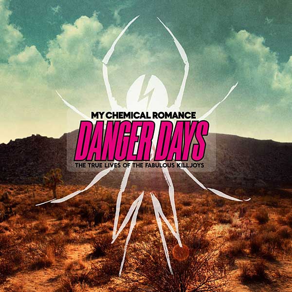
In today's post I'm going to look at double spread page for 'Kerrang' magazine. I'm going to look at the informations that this interview contents and also how it was presented. From looking at this double page spread we can see that on the right we have a group shot of 'My Chemical Romans' and on the left we can columns with all of the information about the interview. On the left hand side we have a title in a form of a quote which have been used to summarise the whole interview. Throughout the whole interview we can see lots of quotes from members of the band. We can also see that main colours are white, black, blue, red and yellow. It makes the whole page stand out. On the bottom of the page we can also see information about their new single. We can also see that this is a 'part 1' of the interview and 'part 2' will be in the next issue. They are saying that 'if you want to know more, buy a next issue'. Furthermore, we can see a little box at the bottom of the picture in which we have all of the band members names. White text on the black background makes text visible. For the title, we can see that they have used the same font as on they have on their new album 'Danger Days', what also shows that the article is about this album. We can also see that they have used MCR's new logo right next to the tittle, which is also shown on the album.