Monday, 31 March 2014
Sunday, 30 March 2014
Question 3. What kind of media institution might distribute your media product and why?
There are many institutions to consider while choose the one that would distribute your magazine. Today we are going to look at some of them. and also which one would be the best for my magazine.
One of the institutions that I'm going to look at is Bauer Media.
Bauer Media Group is a multinational media company head-quartered in Hamburg, Germany which operates in 16 countries worldwide. It's one of Europe‘s leading media companies.
Since the company was founded in 1875, it has been privately owned and under management by the Bauer family. The Bauer Publishing Group comprises 300 magazines worldwide in 15 countries, as well as TV and radio stations .
I've decided to look at this institution as they are a media group that is also distributing Kerrang! magazine, which is one of the biggest most popular rock magazines in UK. It contains the same type of music as my music magazine The Legacy.

"Kerrang! will ensure that we are constantly appealing to our spectrum of readers. From the younger teenage readers who are more open to different genres of rock music – from EMO to Thrash etc, to the readers who respect Kerrang! as an authority when it comes to our scene’s heritage bands."
This institution is working with mainstream and the most popular magazines all around the world. So I think that Bauer Media would be an ideal distributor for my magazine The Legacy as it is very similar to Kerrang content wide. By having Bauer to distribute my magazine, it would have a chance to become mainstream and it also have a bigger chances to be distributed outside the UK as they are operating in 16 different countries.
 IPC Media:
Another possibility for my magazine distributor could be IPC Media. As it is one of the UK's leading consumer magazine publisher. IPC Media is a International Publishing Corporation, a wholly owned subsidiary of Time Inc., is a consumer magazine and digital publisher in the United Kingdom, with a large portfolio selling over 350 million copies each year.
"IPC Media is committed to working in partnership with its consumers, advertisers, business partners and employees to deliver exceptional value, service, innovation and creativity"
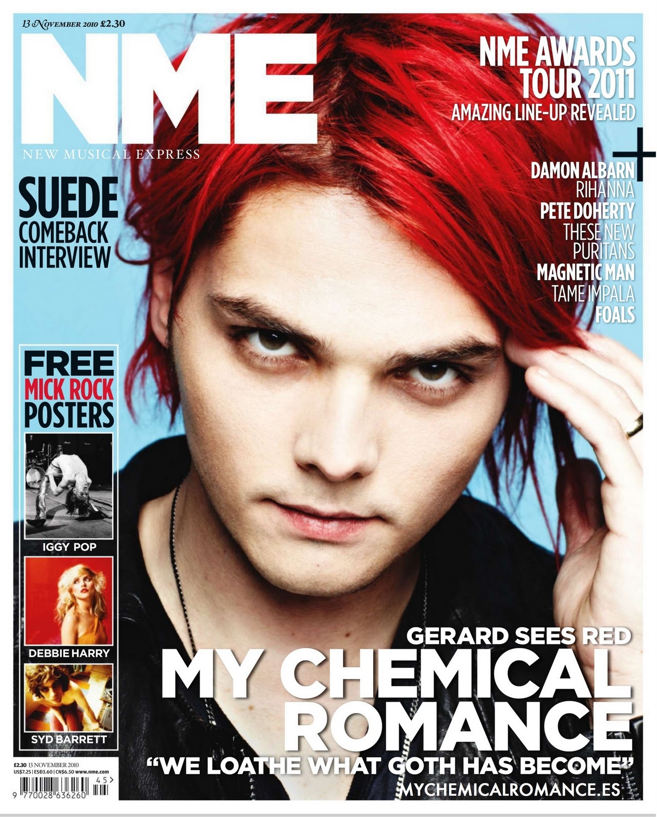
I've decided to consider IPC institution as they are publishing a music magazine NME. I think that the look of my magazine is very similar to the look of NME. However, NME is not focusing on one specific genre of music what IPC like about it as it has a wide target audience. My magazine is very specific about its content.
IPC Media is dealing with some of the most successful magazines in UK so it would a great distribution if I wanted to make my product mainstream. The reason why IPC decided to distribute NME is because of it's wide range in case of genre of the music that they are writing about. So its obvious that this magazine would bring an income for the institution. However, as we know my magazine is very specific so they might not be interested in distribution of my magazine.
That's why I think that Bauer will be the best option for my magazine.
As Bauer has already distributed Kerrang!, this is a clean indication that it would distribute magazine such as The Legacy.
Saturday, 29 March 2014
Question 1. In what ways does your media product use, develop or challenge forms and conventions of real media products?
Cover:
I've based my magazine cover on AP and Rock Sound magazine. I have decided use those two magazines as they are both similar to each other and they are both successful magazines. However, AP is a US magazine and Rock Sound is a UK magazine so they are a bit different from each other in terms of content and layout, that's why I wanted to look at them.
 Title & Font:
The title of my magazine was based on both of this magazines. The font that I've used for my title is similar to Rock Sound's one as I like how simple things can be very effective. I've also decided to use Rock Sound title style as it's readable, the last thing I want is a title that my reader can't read.
The Rock Sound magazine title's also fits in with the style of my magazine, as it's very clean, simple and minimalistic. I didn't want to create a hot mess, like some Kerrang! magazines can look like. That's why I decided to decrease the amount of information on my magazine to the minimum.

When it comes to the colours of my title, I've been inspired by AP magazine to use bright colours that would also match with the colour of the subtitle (name of the band). I wanted to use this concept as it shows the connection between the band and the magazine. So as we can see of my cover page the colour of my title is the same colour as my subtitle.
I liked the way that AP is also adjusting the colour of the title to match the bands image. So every issue has its own individuality, every issue always looks different.
I have also used bright colour just like they did with the PARAMORE issue of AP.
Main photograph:
The main photograph that I've used for my cover was also inspired by AP magazine. However, I decided that instead of using a group shot I'll just use one model for my cover. I decided to do it as I wanted to create an interview that would be just around one main person, lead singer. However I have used the same concept as AP and Rock Sound, my main singer was placed in the middle to show their importance.
The way that I've dressed my model was inspired by Rock Sound magazine as on it we can see a girl wearing casual clothes, very minimalistic clothing with minimal accessories. In addition we can also see a heavy eye make up being used to show the edgy style. So I have used the same style in my photography. My model is wearing a long black t-shirt with choker and dark make up to represent the genre of music.
The photograph does fit with the style of my magazine as it clearly shows the style of the music that my magazine is featuring. As we can see stereotypical aspects in the way that my model looks like. We can see that she is wearing all black, what shows 'emo', dark style that rock/metal music is usually stereotyped with. Furthermore, we can see that she is wearing a choker and a dark eye make up what again is showing this dark and edgy style. The long bangs and messy hair that my model also has also supports the stereotype of being 'emo'/ alternative.
Friday, 28 March 2014
Denotation and Connotation
In today's post we are going to look at denotation and connotation of the front cover of AP magazine.
Denotation means what we can see and connotation means, what it suggests.
 Denotation:
- We can a title of the magazine at the top of the cover in which we can see a number of a issue.
- Furthermore we can see a subtitle 'Paramore' in a bold font style and above it a quote "We gotta keep this thing alive". -Underneath we and also see a slogan 'INSIDE THE STRUGGLE TO MAKE THEIR BEST ALBUM YET'.
- Under that we can see 'PLUS' with other bands names written in a smaller serif font style.
- We can see that both AP title and subtitle Paramore is in the same colour.
- On the bottom of the page we can see names of different artists in white, smaller font.
- When it comes to the image we can see a group shot of two guys and one girl in the middle.
- The girl has a dark edgy make up and bright orange hair, while other guys look more casual.
Connotation:
- By looking at the cover of this magazine, the first thing that we can see is "Paramore". It suggests that they are the main focus is around this band. The use of big, bold font may also signify their popularity.
- The girl in the middle suggests that she is a main person in a band, lead singer. She stands out because of her hair colour and the dark make up. Her dark make up shows that she is a rock singer.
- By placing other members in the back we can suggest that they are less important.
- The use of small font on the bottom of the page while listing band suggests that they are smaller or that they are not important.
- The title of the magazine is in bold large font to make is stand out. Also, blue was used to show connection between the main band and the magazine.
- On the bottom of the page we can see a red strip with a yellow text 'EXCLUSIVE POSTERS INSIDE'. Yellow text has been chosen to stand out in red background.
- On the top of the page we can see list of different articles that are also included in the magazine.
Thursday, 27 March 2014
The use of gratifications theory
In today's post we are going to look at gratification theory. We are going to look at, how my magazine has created a sense of belonging for my readers.

As part of my coursework, I decided to create a Rock Magazine "The Legacy" which name has been chosen by my target audience. Title has been inspired by rock music and bands as every band has its legacy. Within my magazine, I have included number of information about the bands/artists.
-Interview on double page spread
-new album/tour announcement
-give-aways announcement
-names of bands
-quotes "There are no second chances"
Sense of belonging and identity
While creating my magazine I had to think about my target audience. My magazine is aimed for both male and females in age 15-27.
While creating my magazine I was thinking about, what I would like to see in a magazine as I'm part of the target. I decided to look at a bit older audience as it's a magazine for people that are interested in rock music however, they are not a stereotypical 'emos' and 'scenes'. So it is a magazine for more mature people, everyone can find something they like, even if it's just free posters.
 Even that my magazine is a bit more serious I still look at some stereotypes that helped me with photography and look of my content page. The most common stereotype about people that listen to rock is that they wear a lot of black, so I have decided to dress my model in a black shirt, and dark smoky eye make up to show an edgy look. Also the stereotype of long bangs covering one eye has been used in my content page.
Entertainment
As a part of entertainment purposes I've decided to included free posters, giveaway and live reviews in my magazine. It's a way to attract more readers and also give them something that they want to see. By giving them something for free, I know that they are going to come back for more as teenagers don't have much money and they want to get as much as they can. Live reviews are also a part of entertainment as my audience as see how their favourite band did on a gig and maybe even go next time to see them. They might even spot themselves in a crowd.
Escapism
My magazine is creating a form of escapism for my readers, as it makes them feel like they are closer with their favourite band just by reading an interview about them. They might struggle with some life difficulties and this magazine is giving them sense of belonging, they know that they are part of something. That is the reason that people are still buying Kerrang magazine or any other music magazine. People buying this magazine can escape the reality and be somewhere where their favourite band is.
Tuesday, 25 March 2014
How I came up with the name of my magazine?
Today I'm going to talk about how I came up with the name of my magazine. First of all I started with the list of names that I came up with. After that I've created an online questionnaire called 'POLL' which is also linked with facebook. By this I can find out an opinion from anyone. After a week of waiting I looked at they results of voting.

I wasn't satisfied with the results as I realised that people that answered my question weren't part of my target audience. So I decided to create a new list as I didn't like any of the names that I've come up with at the time.
This time I've decided to only ask people that are my target audience. There wasn't a lot of them but by asking just a few people that I knew, I could effectively find out the title that would be most appropriate for my music magazine. As I was also a part of my target audience I had to also vote for my favourite title.
While making a list of titles, I had to make sure that the names are not already taken by other magazines.
MUSIC MAGAZINE TITLE:
-The Legacy Votes: 4
-Reckless Votes: 2
-Wretched Votes: 3
After another try I found the best name for my music magazine, something that my audience would be happy with. However more importantly I also had to be happy, which I was so I decided to go with it and create a title for my magazine. I already had an idea of what I wanted my title to look like, but i still decided to do the research. After the research I found two titles that I like. I like the way that they are both so different from each other. One is very simple and clean and the other is very messy what makes it iconic.


Here we can see both Kerrang! and Rock Sound title. They are both different and iconic. Kerrang's title looks like a broken glass with a stencil like font. Kerrang also has an expenation mark at the end of it was also makes it iconic. In other words, it's easily remebered by its readers. Rock Sound's title is definitely more minimalistic then Kerrang's one, as it doesn't have any effect on the font or something that would make it stand out.
From my research I have also found out that they changing the look of their title to suite the artist/ band's image. So I have also done that in my magazine, I've chose the colour that would suite the look of my artist.
MY MUSIC MAGAZINE:

This is the final idea that I came up with for music magazine title. It's very simple font so it doesn't clash with the image. I had to make sure that the first thing that my reader sees is the image of the artist. I have also adjusted the colour to the rest of the cover and so it matches the artist's image. I have also tried to make it a bit more iconic but putting 'the' in L of Legacy. We can also see that half of the title is covered by my artist's head and 'free posters' sticker, however it is still readable and you can clearly see that it says "The Legacy" without guessing. I have also left 'the' white to contrast it with the title and shadow around it. I decided to use shadow around the title to make it more 3D. As the colour might have blended too much with the background of my cover page.
College and Music magazine
In this post I'm going to look at my progress in editing and creating a magazine. To do that I'm going to compare and contrast two of my magazines 'College magazine' and 'music magazine'.
Before creating the first magazine cover I already had some experience in photoshop, as I'm also a graphic design student. However, editing a magazine cover is a bit different. As in magazine you have to add text so it looks presentable and clean. Throughout the time of editing, I can't say that I've learnt anything new. However, I improved in my designing skills.


From looking at both of my cover pages, I would say that they are both good in it's own way. They are obviously different as one is a music magazine and the other is a art college magazine. So they both have different layouts and content.
From looking at my art college magazine now there are some things that I would change. The font is definitely too 'blocky'. I definitely wouldn't cut the top of the head off. This are only minor changes that would make a big difference. The biggest mistake that I've done with my art magazine is the fact that "LONDON COLLEGE OF ARTS" already exists.
I would say that my music cover tuned out better. It looks exactly how I wanted it to look like. Meaning that the cover page is simple and clean. In my opinion if I added too much information, it would look messy and cheap. That is exactly what i didn't want my music magazine to look like, I wanted to make it simple just like 'AP' magazine that I was looking at. That's why the layout of Kerrang! wasn't appropriate for my magazine. At the cover we can see a focus of the magazine "the big band" and at the top we can see some other key artists/bands that are also mentioned in the magazine. We can also see that I added "free posters", this is typical for music magazines to attracts more readers.
I think that my title is also much better then my art college one, as first of all the name that I have used is an original idea and doesn't exist. I have also tried to make make is more iconic by putting 'the' inside the 'L' of "LEGACY".


I think that my title is also much better then my art college one, as first of all the name that I have used is an original idea and doesn't exist. I have also tried to make make is more iconic by putting 'the' inside the 'L' of "LEGACY".
From looking at both of my content pages, we can see that my music magazine's content page is better. We can see a lot going on, a lot of information.
From looking at my art college magazine, I would say that it looks too simple. There is not enough information on the page. Also, pictures are not annotated, no information about the pictures. The layout isn't bad, however I could have made the text stand out more.
My 'The Legacy' content page is better to look at, it's eye catching as colours complements each other. If I did my content page for art magazine again, I would definitely choose different font size and maybe even colours,as the colours that I've used don't stand out. Also, my music magazine content page looks more professional as I was inspired my Kerrang! magazine. I have also used most of the free space to include as much information as I could. The reason for that is my cover page, as my cover page is very minimalistic so most of the information that I wanted to include had to be on my content page. Furthermore, I have learnt from my mistake of not annotating pictures. I have annotated key pictures, so they don't look just like random photographs.
The circle that I've used for the content was also inspired by Kerrang's more recent issues. We can see that I have also created a giveaway, for which I have designed an ablum cover/logo for the band that I've created "The Reckless Ones".

Sunday, 23 March 2014


Tuesday, 18 March 2014
Work and progress of 'THE LEGACY' (CONTENT PAGE)
In this post we are going to look at my progress on content page and double page spread. As I decided to keep my magazine cover simple, I decided to make my content page full of information. When I was working on my content page I decided to stick to a simple Kerrang! content page.

I like the look of this content page as it is simple and clean. You can see the text clearly, it's readable. The colours are working together. It's not over done, it doesn't have too much information. The pictures are clear and are working together as they are all the same size. One picture is bigger to show that it's a main focus of the issue. I also like the use of columns, its makes the layout look very clean.


Tuesday, 4 March 2014
'The Legacy' magazine cover
As I wasn't quite happy with the way that my cover turned out I decided to work with a bit different layer and get rid of the bar at the bottom as it didn't suit the magazine's style in my opinion. Instead of putting the list of band at the bottom, I decided to put it at the top just like in AP magazine. I have also used different colours for text to make it stand out. I didn't wanted to use too vibrant colours so I decided to stick with yellow and blue as I think that it works with the aqua colour of the title. I have also worked on the photograph as I wasn't satisfied with the way I edited it previously. I decided that I want to keep the cover page simple so there is a minimum of information that I want to add next. As I think that to much information would make my cover look messy.

Monday, 3 March 2014
My music magazine cover (PROGRESS)
In this post I'm going to show my progress of how I edited my picture for my music magazine cover.
1) First of all, I did a photoshoot with a model that I chose will be the most suitable when it comes to the looks of the magazine. I had to think about the clothes that would suit the image of the magazine. I decided to dress her in a black t-shirt with a cat on it and black shorts. I decided to dress her that way as black clothing is matching the rock image. The choker that she was wearing during the photoshoot looks a bit Gothic so we can see alternative look that suits the type of music that i want my magazine to represent. Also, the hairstyle is very simple as messy to show that image.

2) Furthermore, I decided to edit the background and by the use of photoshop I created a white background, so I have clean canvas to work on. During the editing I have also worked on the way that I wanted my picture to look like. I wanted colours to be slightly faded as it gives the image a soft look, which I was looking for. I did that as I already had a white background so colours that are too vibrant would look a bit too harsh. I had to make two copies of that photograph,one that had no background and one that did. I had to do it as I wanted to put the title of the magazine at the back.

3) Once I finished editing my picture I decided that it is a right time to start working on all of the information that I want my magazine to have. The main colours that I used were Aqua, Yellow, White and Black as they are complementing each other. They are making each other stand out. 'The Legacy' is in very simple and bold font, in Aqua colour. I also decided to layer 'the' on letter 'L' as it makes it look more iconic. It's something that people will remember about my magazine. I have also used a shadow at the back of the font to make the title look more 3D. The layout that I decided to use is pretty simple and I was definitely inspired my AP magazine. It has a minimum information as is focusing on one band when it comes to cover page. For the quote I decided to use a different font and colour so it doesn't blend with the rest of the magazine. I have also used some parts of Kerrang! magazine such as, the bottom information bar where we can see what other bands are mention in the magazine. However, I'm not happy with the way that it turned out so I'm going to change it and compare.


Music magazine research (COVER)
For my AS media coursework I'm going to create a rock music. So today I'm going to look at some already existing rock magazines that will give me an idea of what I want my magazine to look like.
Cover:


Cover:
Here we have an example of 'AP' magazine. It is an American rock music magazine. We can see that the layout of this magazine is pretty basic, it doesn't have much information on the cover. Also we can see that they are changing the colours of the font depending on the band that they have on the cover. The colours that they have used stand out and are very eye catching. There isn't much information on the cover, they are focusing on the band it's self. We can see a group shot of 3 band members, we can see that Hayley Williams is at the front/in the middle what shows that she is a main person in the band, she is a lead singer. The clothes that they are wearing on the picture are very casual.
There we have an example of 'Kerrang!' magazine. From the first look we can see that it is different than 'AP' magazine as there is more information on the cover. We can also see pictures of other bands that they are mentioning in the magazine. We can see that they have used colours such as green, yellow, black and white. They have used bright colours in order for the information to stand out. The layout of the magazine is good as there is no 'dead spaces'. The picture that has been used is a low angel shot of a lead singer and guitarist, Billie Joe Armstrong. It shows that he is important, the main article is about him. We can see that there are posters included with the magazine. Also we can see that there are competitions for the readers of the magazine.
This is an example of the 'Rock Sound' magazine cover. On this cover we can see that the main colours are black, red, white, yellow and some blue. The colours are working together nicely as there are complementing each other, what makes them stand out. This magazine I would say is like a mixture of both magazines that i have already analysed before. We can see a group shot of the band, with information on the cover. The way that the text has been arranged is very clean as everything is nicely in columns. The only thing that I would change about this magazine is the group shot, the way that lead singer, Oliver Sykes is at the front/middle is great. However, on the right hand side other members should be moved as we can barley see them. Use of shadow is also very good as we can only see half of the singer's face, this might relfect the look of the main interview inside of the magazine.
Sunday, 2 March 2014


Subscribe to:
Posts (Atom)